IELTSライティングは、タスク1とタスク2に分かれ、タスク1では、データや統計を読み取り、分析して、150文字でわかりやすく簡潔に要約する力が求められます。
リポート形式の解答を求められるため、慣れていないとうまく解答できず、スコア獲得が難しくなります。この記事では、タスク1の構成と書き方のコツをご説明します。
タスク2の方が配点が高いと言われていますが、タスク1でもしっかりとスコアを獲得し、高得点を目指しましょう。
IELTSライティング タスク1┃出題形式
IELTSアカデミックのタスク1は、図表を分析し内容をリポートする課題が主な出題形式です。
設問タイプは図表の分析だけではなく、次の3つがあります。
- 図や表の分析
- 地図問題/都市や公共施設の移り変わり
- プロセスマップ
今回は1つ目の、図やグラフ・表のリポートの書き方を説明していきます。
図やグラフ、表の分析
タスク1では、テーブルや棒線ブラフなど、図表の分析リポートを問われることが多く、出題率は全体の5割ほどです。
書き方のパターンを覚えると、表現を使い回すことができるので、時間をかけずに解答することができます。しっかりと対策氏、試験に臨みましょう。
解答のコツ
特に、図表の分析では、比較級をなるべく使うことを心がけましょう。与えられたデータに対して、ただ数字を羅列するのではなく、具体的に比較することで、レポートとしての評価が上がります。
また、正確さも評価対象になるため、数字を記述する際は、間違えず正確に書くよう意識しましょう。
最大値と最小値は、グラフや表の読み取りで1番大事なポイントです。必ず記載しましょう。また、数値が同じ個所があれば、そこにも注目しましょう。
では、タスク1の構成について説明します。
タスク1の解答構成
タスク1は、どの設問タイプでも次の4段落構成で解答しましょう。
- イントロ
- 概要(まとめ)
- 詳細1
- 詳細2
この構成通りに解答することが、スコアを安定させるポイントです。
各段落の内容
図表の分析リポートでは、各段落は次の内容で解答します。
| 段落1 | イントロダクション | 問題文のパラフレーズ(書き換え) |
| 段落2 | 概要 | 特徴をまとめる メインの特徴を2つほど挙げて、2, 3文でまとめる グラフや表の場合は大まかな変化を簡潔に述べること ※ここでは詳細な数字は挙げません |
| 段落3 | 詳細1 | 特徴を細かく述べる 変化と数字の詳細を述べる(大きい値と小さい値を述べる) |
| 段落4 | 詳細2 | 段落3以外の特徴を細かく述べる 別の変化や数字を詳細に述べる |
グラフや表のパターン【4つのタイプ】
IELTSライティングのタスク1で出題されるグラフや表は、大きく次の4パターンに分けることができます。
- 棒グラフ(bar graph)
- 折れ線グラフ(line graph)
- 円グラフ(pie chart)
- 表(table)
1つのグラフ内で数値や変化を比べることが多いですが、2つ以上のグラフについてリポートを求められるケースも多々あります。
【例】1990, 2010, 2020年の円グラフの比較など
リポートの時制
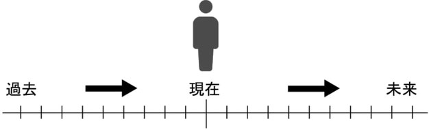
グラフや表の分析問題は、時制に注意して書きましょう!
グラフの課題は、ほとんどが年代ごとに変化していくデータの分析です。
今を基準として、過去のことは過去形、未来形は未来予想の時制を使用します。過去の年代の記載がない場合や、データーの年代が記載されていない、もしくは不明な場合は現在形か現在完了形を用います。
★IELTSアカデミックライティングのタスク1で用いる時制については、下記の記事で詳細を紹介してるので、参照してください。

①棒グラフ
例題
The bar chart shows different methods of waste disposal in four cities; Toronto, Madrid, Kuala Lumpur and Amman.
Summarize the information by describing the main features of the chart and making comparisons where appropriate.

解答例
イントロダクション:問題文の言い換え
The given bar chart illustrates various ways of disposing of waste, namely, landfill, incineration, recycling, and composting in four cities.
まとめ:特徴をまとめる
As being observed from the chart, landfill was the most popular method of waste disposal used in Toronto and Amman, while other cities chose incineration as the most effective solution for disposing of waste.
詳細1:数字を入れた詳細1
In particular, landfill disposed of about 75 percent and 50 percent of total waste in Toronto and Amman respectively. Meanwhile, the figures for Madrid and Kuala Lumpur were approximately 30 percent and 17 percent each. Besides, those two countries had the largest proportion of the total waste disposed by incineration, followed by Amman and Toronto.
詳細2:数字を入れた詳細2
By comparison, Madrid and Kuala Lumpur had the largest percentage of total waste solved by a method called recycling with over 20 percent , being above two times higher than those of the others. Interestingly, compositing was the least popular among four given method of waste disposal in all the cities with below 10%.
②折れ線グラフ
例題
The graph below gives information from a 2008 report about consumption of energy in the USA since 1980 with projections until 2030.
Summarize the information by selecting and reporting the main features, and make comparisons where relevant.
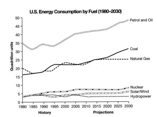
問題文にあるprojectionsは未来予想の時制を使います。
未来予想時制とは「be projected to」「be forecast to」「be expected to」「be likely to」など、「~が予想される」という表現です。
解答例
イントロダクション:問題文の言い換え
The chart compares the amount of six different kinds of energy consumed in the USA since 1980 followed by a prediction until 2030.
まとめ:特徴をまとめる
As a whole, petrol and oil were consumed the most and this trend is projected to continue in the future. In addition, while there is an upward trend in the amounts of petrol and oil, coal and natural gas , that of nuclear, solar and hydropower will remain more or less unchanged.
詳細1:数字を入れた詳細1
In more detail, the figure for petrol and oil dropped to 30 quadrillion units in 1985. It increased significantly from 1985 to 2015 and is anticipated to reach a peak of over 50 quadrillion units in 2030. Similarly, there was a fall of approximately 3 quadrillion units in the amount of natural gas consumed in 1985. This figure is predicted to remain at 24 quadrillions in2030, compared to a dramatic rise by 15 quadrillions in the figure for coal.
詳細2:数字を入れた詳細2
On the other hand, the amounts of nuclear, solar and hydropower were about 4 quadrillion units in 1980. However, nuclear and solar are forecast to reach 6 and 5 quadrillion respectively until 2030 while hydropower fluctuated from 1980 to 2015 and is expected to stabilize at 3 quadrillion units in 2030.
➂円グラフ
例題
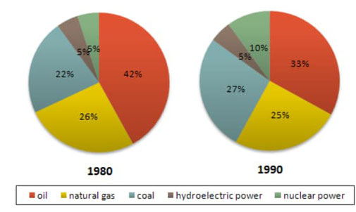
The two graphs show the main sources of energy in the USA in the 1980s and 1990s.
Summarise the information by selecting and reporting the main features, and make comparisons where relevant.
解答例
イントロダクション:問題文の言い換え
The two pie charts give data on the percentages of several main energy sources from 1980s to 1990s in the USA.
まとめ:特徴をまとめる
Overall, there were predominant proportions allocated to oil during the 1980s as well as 1990s. Moreover the percentages of the remaining sources remained relatively unchanged over the period.
詳細1:数字を入れた詳細1
During the 1980s, 42% of total main energy sources were reported to be oil, whereas 5% of unclear power was utilized for generating energy. However, a decade later, there was a moderate reduction of 9% to 33% in the proportion of oil usage. meanwhile, the figure doubled to 10% for nuclear energy in the 1990s.
詳細2:数字を入れた詳細2
Apart from that, the consumption of natural gas inconsiderably decreased by 1% during those years, and 5% for hydroelectric power remained the same. Moreover, a slight increaser of 5% can be observed in coal utilization, to 27% in the 1900s.
➃テーブル
例題
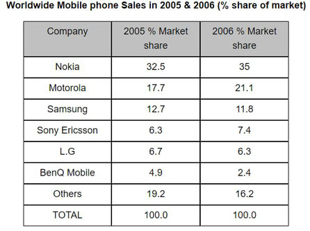
The table shows that worldwide market share of the mobile phone market for manufacturers in the years 2005 and 2006.
Summarize the information by selecting and reporting the main features, and make comparisons where relevant.
解答例
第1段落のイントロ:
イントロダクション:問題文の言い換え
The diagram illustrates the mobile phone producers in terms of their share of global market in the years of 2005 and 2006.
まとめ:特徴をまとめる
It is immediately apparent that Nokia was the largest market share in both years. While the percentage of market share of Nokia, Motorola and Sony Ericson increased, that of the remainder companies fell.
詳細1:数字を入れた詳細1
As can be seen from the table, Motorola experienced the highest growth which rose by 3.4% from 17.7% in 2005 to 21.1% in 2006. Also, there was a slight increase in the percentage of the market share of Nokia and Sony Ericson which went up from 32.5% and 6.3% in 2005 to 35% and 7.4% in 2006, respectively.
詳細2:数字を入れた詳細2
In a stark contrast, BenQ Mobile witnessed a moderate decline from 4.9% in 2005 to 2.4% in 2006, a fall of 2.5% from the pervious year. Similarly, Samsung and LG went down marginally to 11.8% and 6.3% in 2006 in that order. Finally, there was a dip in the market share of other companies by 3% to 16.2% in 2006.
各解答例のように、どのタイプのグラフでも、4段落構成(イントロ、まとめ、詳細1、詳細2)は統一しましょう。
タスク1は、数字を入れた書き方のコツを掴むことが大事なので、書き慣れて表現を覚えていきましょう!
Task1:制限時間20分の使い方
IELTSライティングは、時間との戦いです。解答を書き始める前に、しっかりとプランニングを行うことが非常に重要です。
特に、タスク2のエッセイの方が配点が高いとされているため、タスク1は20分以内に仕上げ、タスク2のために時間を確保する必要があります。
アウトラインを作る
何について言及するのかをまとめておくことで、全体のまとまりがあるレポートに仕上ります。
アウトラインを考えないまま書き始めると、解答の内容にまとまりがなくなってしまうため、危険です。
- 問題文を読み、どのタイプの課題であるのかを把握する
- 「どの時制で統一するか」を決める
- ざっくりと特徴を考える(まとめに必要な特徴を1~2つ挙げる)
- 詳細点をいくつか箇条書きにしておく
上記の作業が完了したら、このアウトラインを元にして解答することに専念しましょう!
グラフ特有の使える表現
グラフ特有の表現を習得することで、「うまく書けない!」という問題を解決しましょう。
増減を表す表現
統計問題などでは、数字が増減などがあります。覚えておくと試験で確実に役立ちます。
⇧増加
increase
climb
grow
go up
rise
rocket
skyrocket (急激に)
jump (急激に)
soar (急激に)
leap (急激に)
⇩減少
decrease
go down
fall
decline
dip (急激に)
slump (急激に)
reduce
plummet (急激に)
plunge (急激に)
その他の便利な動詞
- take over(動詞) :~を上回る
【例】Japan took over the winning cap slowly from 1995 onwards. - reach a peak of / peak(動詞) : ~のピークに達する
【例】The number of viewers reached a peak of 3.8 million.
The number of viewers peaked at 3.8 million. - fluctuate(動詞):上下する・変動する
【例】The number of travelers then fluctuated over the next nine years. - level off/ level out(動詞):水平になる・横這いになる
【例】The rate is expected to level off till the end of the current century. - plateau(動詞) :(急激に上がった後)水平になる・横這いになる
【例】The number plateaued from 2013 to 2015 at 1.5 million. - outnumber(動詞) :(数で)上回る
【例】female graduates outnumbered male students. - recover(動詞) :回復する
【例】The spending recovered slowly but comparatively steadily. - remain steady (stable / constant / unchanged / static) (動詞) :安定している
【例】The number of local students reached at approximately 60000 and remained steady for the next 4 years. - tail off(動詞) :(次第に)小さくなる・弱くなる
【例】Between 2011 and 2020, it is anticipated to tail off, at about 9%. - double(動詞) :2倍になる
【例】The lunch sales doubled from £4000 to £8000. - halve(動詞) :半減する
【例】The amount of export revenue halved from 1990 to 2000. - edge up(動詞) :ジリジリと上昇する
【例】New home prices edge up slightly in July.
便利な副詞
便利な表現の1つに副詞を使って「どれほど上昇したか、どれほど減少したか」の程度を示しましょう。高得点に近づくにはこの副詞の使い方は必須です。
- twofold:2倍に
【例】Internet users increased more than twofold from 1979 to 1989. - slightly / negligibly / marginally:わずかに
【例】The museum visitors has grown slightly. - steadily / constantly:堅実に
【例】The sales rose steadily in 2010. - significantly / considerably / dramatically / markedly / drastically /noteceably:劇的に
【例】the population of the young dramatically declined to 30% of the total. - sharply / steeply / rapidly:急激に
【例】the figure has gone up sharply. - moderately / modestly:緩やかに
【例】the number of visitors moderately recovered. - gradually:徐々に
【例】the ratio of federal government debt then gradually fell to a little above 31 percent in 2008.
その他の表現
その他、図表の説明で大事な表現をピックアップしました。ぜひ、参照してスコアアップに役立てましょう。
- account for(動詞) :~を占める
【例】food accounts for 60% of the total income. - make up(動詞) :~を占める
【例】food makes up 60% of the total income. - give information on:~の情報を与える
【例】the table gives information on the income disparity. - One of the noticeable changes is :一つの顕著な変化は
【例】One of the noticeable changes(features) is that - compared to:~と比較して
【例】The figure increased by 45% compared to that in 1969. - followed by:~が後に続く
【例】Asia used the greatest level of water, followed by Southeast Asia. - respectively (副詞) :~それぞれ
【例】at 84% and 79% respectively. - with different level :異なった数値で
【例】All the kinds of crime changed over 9 years with different level. - have(show) a downward trend:下降傾向にある
【例】The number of crime shows a downward trend. - have(show) an upward trend:上昇傾向にある
【例】The number of crime had an upward trend.
数字と前置詞の使い方
一定の数値・数量を表す際に、何を表すかによって、使われる前置詞が異なります。
以下の表を参考に、数字を入れた文章を作成する際には適切な前置詞を使いましょう。
| 前置詞 | 使用場面 | 例文 |
|---|---|---|
| at | 一点を表す | The number of students began at 100. |
| by | 差を表す | Fast food consumption decreased by 5,000. |
| to | 帰着点を表す | The visitor to the island increased to 65,000. |
| with | 順位と併用して使用 | Football scored highest with 68% of vote Paris is second in the table with 76 million passengers per year. |
また、一点を表す‘at’ は、金額や速度、温度を表す時にも使用できます。
図表の説明で忘れてはならないこと
図表を読み取り、データを分析する際には、以下の点について説明することを忘れないようにしましょう。
【データーの選抜方法】
- データの説明(年齢層、製品の数、人口の割合など)
- 注目すべき顕著な数字(高値、低値、変動の激しい箇所)
- 全く変わらない同じ数字(同じ数値、変化が見られない箇所)
- 全く逆の傾向
- 類似している傾向
【書くときの注意点】
- 明確な導入文の言い換え
- 情報から読み取った特徴を提示
- 主な特徴を数値で提示
このように、データの高値、低値について言及するようにしましょう。
「自身が読者の立場に立って、統計から知りたいことは何か?」を考えると、解答しやすくなります。
例えばスマホの普及率について、年ごとの違いを表している図表では、一番普及率が低い年と、普及率が高い年が気になりますね。
タスク1(図表)の表現方法の練習問題
タスク1の練習問題を紹介します。( )に当てはまる英単語を考えてみましょう。
※問題をクリックすると解答が表示されます
Q1. The number of visitors to the café reached a ( ) ( ) 250.
A. The number of visitors to the café reached a ( peak ) ( of ) 250.
(カフェの客数は250人というピークに達した。)
Q2. The number of students ( ) ( ) 150 in 1980 and ( ) ( ) over 200 in 1990.
A. The number of students ( started ) ( at ) 150 in 1980 and ( increased ) ( to ) over 200 in 1990.
(生徒数は1980年の150人に始まり、そして1990年の200人以上に増えた。)
Q3. Production plummeted ( ) 120 units per day, ( ) 600 to 480.
A. Production plummeted ( by ) 120 units per day, ( from ) 600 to 480.
(製造は600から480まで、一日当たり120個急減した。)
Q4. The number of users ( ) from 1990 to 1998.
A. The number of users ( doubled ) from 1990 to 1998.
(利用者は1990年から1998年にかけて倍増した。)
Q5. The proportion of users ( ) ( ) ( )increase in 2030.
A. The proportion of users ( is ) ( projected ) ( to ) increase in 2030.
(利用者の割合は2030年には上昇することが予想されている。)
Q6. Sales ( ) between about 90 and 210 from 1998 to 2010.
A. Sales ( fluctuated ) between about 90 and 210 from 1998 to 2010.
(売上げは1998年から2010年にかけて、ほぼ90から210の間を上下した。)
Q7. There was ( ) ( ) ( ) in the dinner sales in 2010.
A. There was ( a ) ( drastic ) ( increase ) in the dinner sales in 2010.
(2010年には、ディナー売上げの急上昇があった。)
Q8. Sales ( ) between 2005 and 2010.
A. Sales ( plateaued ) between 2005 and 2010.
(売上げは2005年から2010年の間、安定していた。)
IELTSライティング タスク1 グラフ&表問題【解答例付き】まとめ
IELTSライティングのタスク1で出題される図表の説明は、1番出題頻度が高いと言われています。
データ分析で欠かせない対策は、図表の特徴を読み取ることです。高値、低値、変化しない数値など、明らかに他の数値と差があるものは必ず提示しましょう。
タスク1は書き慣れる、表現の仕方を覚えることでスコアアップにつながります。数値を入れた文章の書き方をしっかりと定着させるためにも、タスク1の書く練習は忘れないようにしましょう。
MAEのIELTSオンライン講座は苦手なアウトプットに特化した練習が可能です。
ライティングはきめ細やかな添削形式で書き方や表現を学習。
無料体験は随時受付中!